RUSH Design Events
As a subsidiary entity within Hookline Falls Creative, HFC: RUSH is a livery designer’s dream that intends to inform of newer technologies and resources and applying them within a niche medium popular enough to have made a community.

Other separate livery design hubs aim to provide honest feedback along with seasonal, month-long events where members would be given a prompt and submit their work to a strict panel. RUSH wanted to stray away from the prior notions of harsh criticism and was marketed towards beginning or casual livery designers.
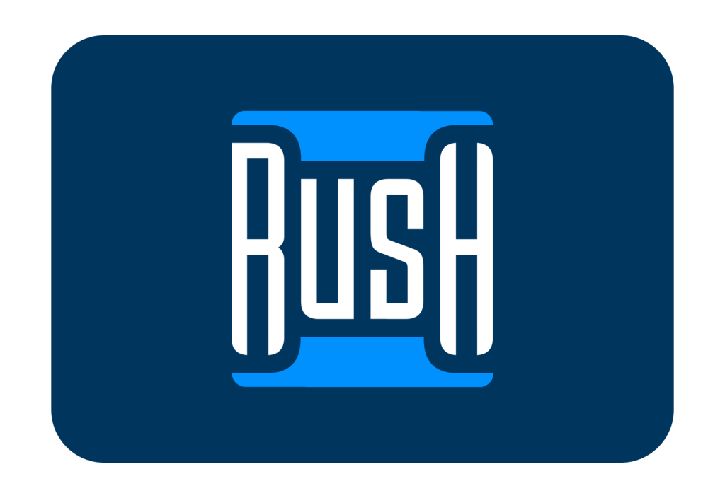
With a healthier take at design analysis, blue was on the agenda to illustrate a trustworthy capacity out of those who represented RUSH. Additionally, the azure contrasted that of the pinks and indigos other livery design servers presented to their audience. The chosen complementary azure and navy blue combination emphasize the commitment to foster a positive and supportive environment for livery designers.
The HFC: RUSH mark involved an approach to amplify the typography to imitate speed by compressing and crimping the letters to match a blur. The indentations for the ‘R’ and ‘H’ in RUSH contribute to the uniqueness of the logo. Unlike some competitors who employ non-originally created typefaces in their wordmarks, HFC: RUSH takes pride in its custom typography, ensuring a brand identity that stands out and aligns seamlessly with the community’s values.
