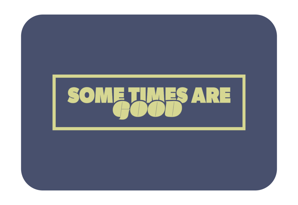
Some Times Are Good
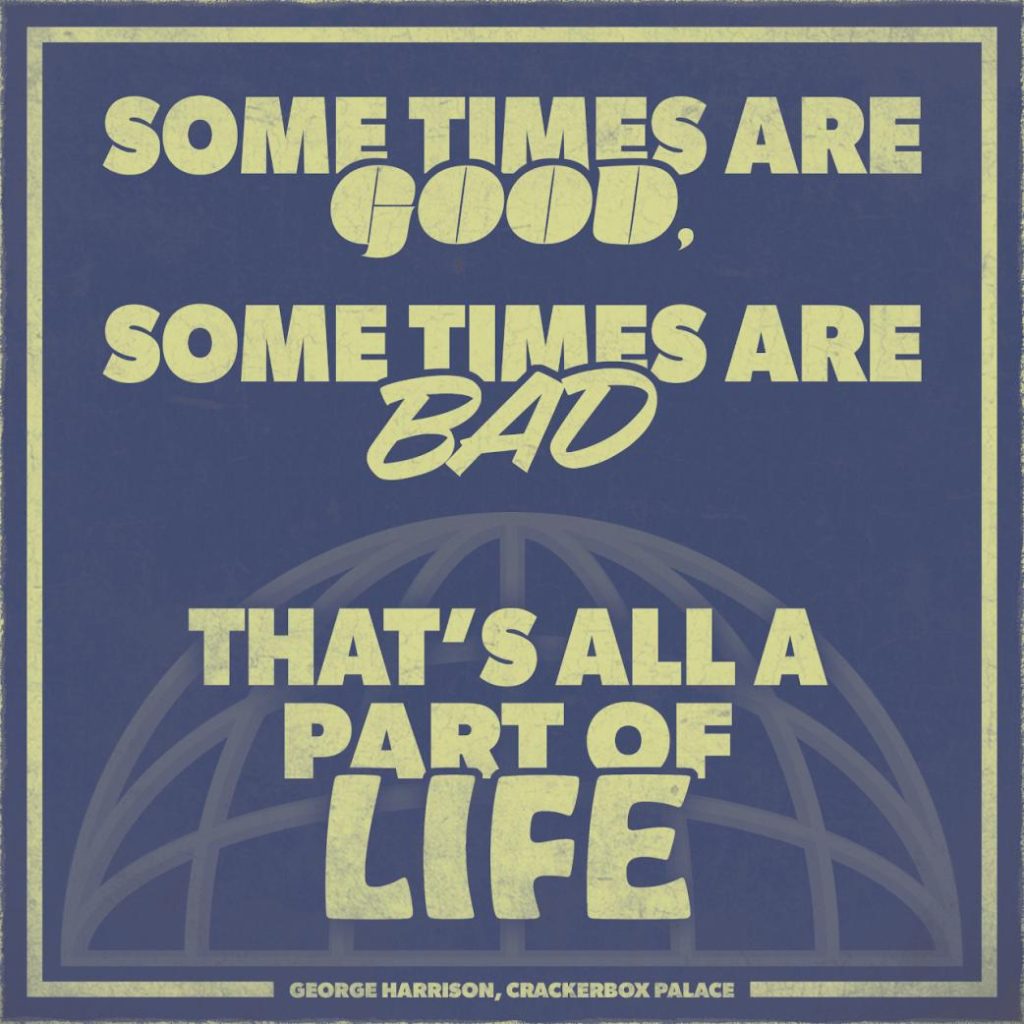
“Some Times Are Good” is a diligently crafted album cover design for George Harrison’s iconic 1976 hit “Crackerbox Palace.” The design intentionally exudes a weathered and vintage aesthetic, invoking the nostalgia of reclaimed album covers from the past. The aged surface, reminiscent of well-worn vinyl, sets the tone for a visual journey through time. Against a subtle blue background, the shaded yellow text guides the eye reinforcing a worn and aged appearance for visual appeal.

The carefully chosen lyric from the song “Crackerbox Palace” is presented in a predominantly heavily weighted sans-serif typeface, while the strategic use of different typefaces for “Good,” “Bad,” and “Life” adds nuanced layers to the text, aligning with the diverse meanings associated with each word.
Below the lyrics, a 3D globe design takes center stage, comprised of thick lines in the opaque yellow that perfectly encapsulates the essence of 1970’s album cover design. The globe’s retro aesthetic transports viewers back to the era when the song was released, creating a seamless emotional connection between the visual representation and the music it represents.

The addition of the yellow square outline around the design serves as a composition frame anchoring the design of text and visually imagery. This subtlely enhances the overall piece, providing a cohesive and polished finish. The design’s intent is twofold, as it represents a visual tribute to a classic song while simultaneously capturing the spirit of an era that compelled philosophical analysis regarding the authenticity of life.
