
Wrestling Federation of America
The collaboration with the Wrestling Federation of America evoked a dynamic design journey. A primary focus entailed the cultivation of branding relative to t-shirt designs. The designs were executed to resonate with the fervent regional wrestling community. With over two decades of history entrenched in the New England wrestling scene, the Federation had gaps in their branding package and sought to elevate it through merchandise offerings that exemplified its roots with modernized flair. With an integral understanding of the market dynamics, the strategy prioritized black t-shirt designs. This is due to their proven track record as the top-selling wrestling shirts throughout the industry, and their cost-effectiveness in production and ordering.
Among the original standout designs, an emerging favorite entailed one for wrestler, “She’s Mean” Little Mean Kathleen. As an iconic wrestling persona, it was imperative to elevate her brand for herself and the company. The t-shirt features an azure, black, and magenta leopard print design that enhances the former look of her wrestling attire, and includes furthered accentuation through a custom yellow typeface that embodies the “zaniness” of her character.
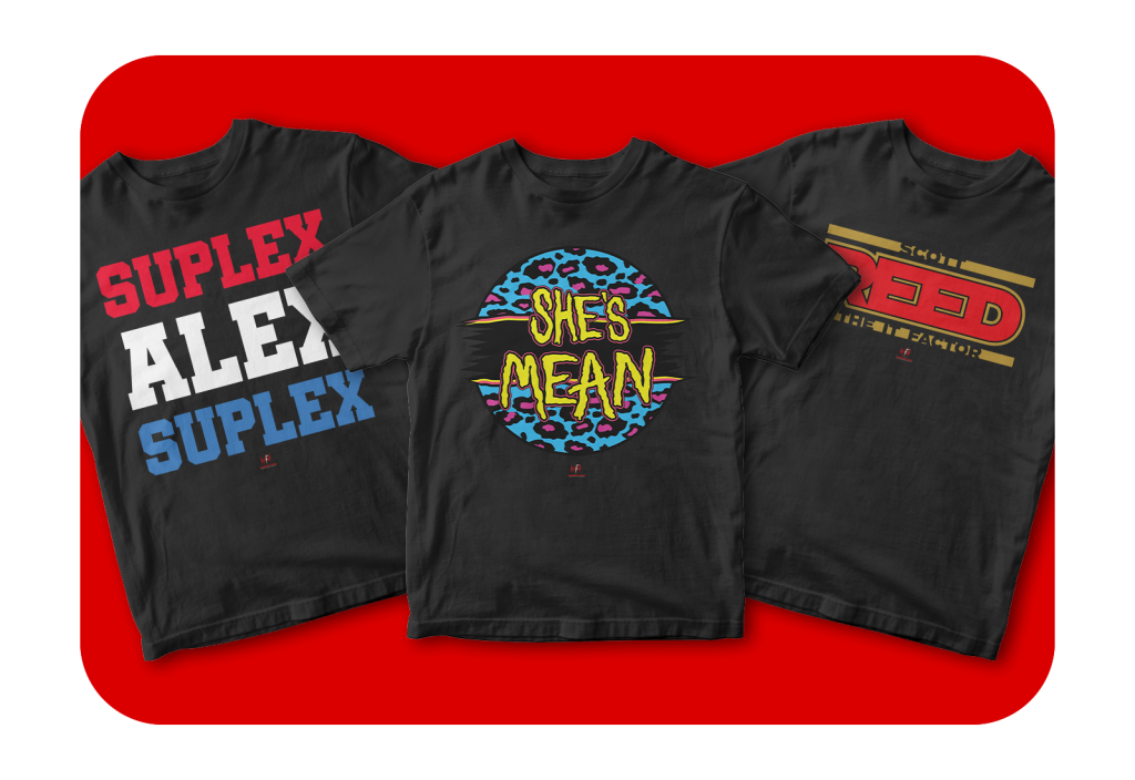
The “Suplex Alex Suplex” design for wrestler Alex Kane required an expansive design approach focusing on the typeface aspect of the brand. Albeit straightforward in presentation, its mastery lies in the intention of the execution, to command attention and to reinforce brand awareness synonymous with his wrestling prowess. He is ranked 34th overall on the prestigious 2023 Pro Wrestling Illustrated 500 list illuminating his regional and global talent. Hence, his design needed to mimic his technical expertise and be compelling, and not flashy.
Finally, “The It Factor” design for Scott Reed reflects his distinctive persona with an edgy aesthetic that appeals to a broad spectrum of wrestling enthusiasts, encapsulating the spirit of the Wrestling Federation of America’s enduring legacy.